Last Friday (or yesterday) I went to Amsterdam to meet the people behind Backbase. When we talked about web related matters (it seems that more companies like Mozilla) the subject Drempelsweg (a Dutch accessibility initiative) came up. Before I continue with the question they raised, I feel I have to write about my e-mail conversation with Drempelsweg earlier this week.
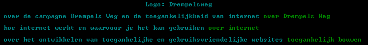
Although the conversation isn't really finished, they never replied my first reply; it is quite interesting to see how they interpreted their own guidelines. First, let me show you two screen shots (markup is based on the Historiae: Photograph Gallery):
(The alternate text I have given to my IMG elements above, isn't the most perfect alternative text either. However, there is a difference. I'm not an authority on accessibility where they are and the mistakes they make are (slightly) bigger (and that is really my opinion, just as everything else on this small weblog).)
As you can see on the screen shots, the text you get to see or hear, when you visit the homepage with an alternative device (like a text browser) is ridiculous. When I mailed them about this issue (and another, minor, one) they responded to me that alternate text on images is needed, this is one of the guidelines they provide (based on the Web Content Accessibility Guidelines).
Personally, I am all for such guidelines and accessibility. But I also in the opinion one should think realistic. When an image doesn't add anything at all to the content, like the little images in front of the primary navigation, they should not have alternate text, since nobody benefits from the fact they have. The Logo:
prefix they have, as seen on the screen shot, is probably the strangest thing I have ever seen. (That is not true, I have seen it before, since people think the ALT attribute is the TITLE attribute.) Such prefixed shouldn't be used at all. You want to provide alternate text to the end user, not metadata.
Back to the subject. The issue that was raised is that web applications and large web sites have really long lists of links (let's stick to large web sites, since applications have lot's of problems). Let's say they have a nice ordered list menu with about 60 different (nested) items. How is a blind person going through such a list? Isn't it better to provide alternate versions to such users? And even then, how do you guide them through all the information available?
That is quite a big problem and the above is only for retrieving information. That is the way I currently look to those people, they browse the web to gather information. But perhaps they also like subtle things, like lot's of visual minded people "like" light grey, those people might enjoy sounds et cetera, which are far from supported (don't even start about the fact that some people like their own music :-)).
Fortunately, me and Arthur Steiner (who's website is almost registered, go go go!) are invited by Eric Velleman for a conversation at Stichting Accessibility, one of the leading "accessibility platforms" in Europe. I want to ask some clarification about the above mentioned problems on today's web and if I get such clarification I will be happy to share it and post the information on Accessify. (The reason this post is not posted on Accessify is probably clear.)
The problem is (I know these guys) they have so much to do(=work) that they can't work on there own site or old project sites. At this moment they are without a webmaster and they are not coders them self. (Old webmaster was one of the images-javascript-tables type). Beside Drempelsweg is a older project which was supported by the government but isn't really living any more. You should better look to new productions like softwareinzicht.nl. This site uses modern css techniques like notable-layout and image-replacements.
Back to the subject. The issue that was raised is that web applications and large web sites have really long lists of links (let�s stick to large web sites, since applications have lot�s of problems). Let�s say they have a nice ordered list menu with about 60 different (nested) items. How is a blind person going through such a list? Isn�t it better to provide alternate versions to such users? And even then, how do you guide them through all the information available?
Nomatter how hard you try it wil always be a huge problem. I think the best accesible structure for a blind man is totally different from the best accesible structure for a guy who can see.
I try to solve this problem by using anchors. I use some simle anchors to create links within the document. This way a blind guy can skip the navigation (or any other peace of information) and instantly jump to the content.
Another way to solve this problem is using accesskeys.
Here is also a nice Dutch article about a blind guy who is trying to surf the web: Blind Surfen
With regard to the alt text, in this case I feel it shouldn't be there at all, because the images used are just for presentational purposes. If you write an article about the Himalaya it makes sense that there should be a picture alternatively labeled as a beautiful photograph of Mt. Everest. It doesn't make sense to label each and every graphical element that is there for presentational purposes. Hence, in your example, the images should not be in the HTML, but in the CSS as background properties. That solves the problem very neatly.
I think that your example of an article about the Himalaya is wrong. You might want to put that text in the TITLE attribute, to tell people what you think about the picture, but it isn't (a good) alternate text.
(If I'm blind, I don't care about photographs/pictures, I care about sound and descriptions.)
I completely agree with "replacing it" with CSS, that is indeed the best solution.
But alt text isn't just for the blind; don't forget it's also for people with text browsers, and people who have images otherwise disabled. And in the case of the Himalaya example, the picture of Mt. Everest is content, and so it shouldn't just be hidden from people only because they can't view it immediately. These people can still turn on graphics, download the picture to their image viewer, etc. But only if they know it's there.
I don't disagree that purely presentational images should be left with blank alt attributes. But if you can't use alt to label non-presentational content images, when can you use it? (Aside from fixing-up semi-presentational "text as images" pictures)
Many people like to use images for page headers. The image contains "styled" text, then ALT is needed.
Actually, you would like to do the above with CSS only, which isn't supported that well (only by Opera). The problem is the IMG element itself, which is very poorly designed. See also: Guidelines on ALT texts in IMG elements.
Apart from just being an example... what's more to say about a picture of Mt. Everest for a blind visitor? You could wax lyrically about the cold wind biting your face at sunrise, your throat being dry from breathing compressed air, but hey, I'm not writing a novel here. Maybe the best way to treat images is to say that there's an illustration and give a brief description that doesn't break up the flow of the text too much. Who wants to read six paragraphs of description of a picture of Mt. Everest if they're there for practical travel information?
Indeed, therefore I think one should not specify alternate text at all (alt="") in such occasions.