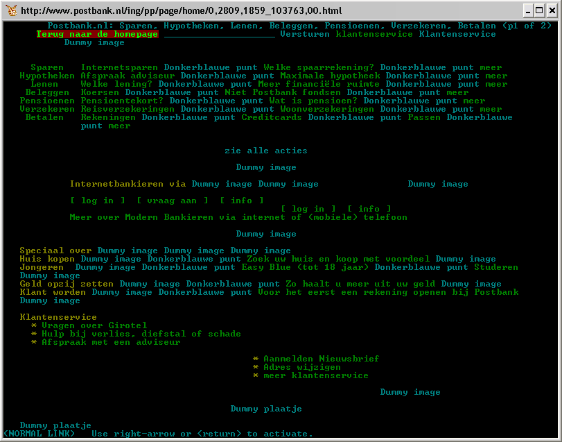
 Most of the text marked in blue is the
 ALT text for images (almost all).
Is quite a bad combination. Postbank has no idea how it should be used. If the "webmasters" of that site ever read this post: Guidelines on ALT texts in IMG elements.
 Most of the text marked in blue is the
 ALT text for images (almost all).
And don't even think of validating that website. I tried and noticed they were using the ID attribute as a CLASS attribute, indeed, multiple times.
It is a shame that big financial institutions hire people that obviously do not know their craft. And we need to trust them with our money?
And what's up with the funny image placement? It is placed just under the "fold" as if it has position:absolute;padding-top:100%;... Using Mozilla/5.0 (X11; U; Linux i686; en-US; rv:1.6) Gecko/20040207 Firefox/0.8.
It is a bug I think. I still have to write a proper test case. Another problem is when I add this rule to my style sheet: p{overflow:auto;}. The image disappears. There are a lot of floating and overflow bugs, so I have to sort things out first, before I file a new one.
Anne, just for a laugh, you can give schiphol.nl a try in lynx - imo one of the, if not the text-browser un-friendliest page.
I'm posting this from lynx. It is really a great (text) browser. And all that thanks to the compact build on your site csant. Really easy to install and to use.
Thanks!
Nice to see someone checking out banks on the internet. I tried to do the same thing with Fortis (Belgian bank). They really don't care, I think. KBC still wants you to use Netscape 4, anything newer will not be allowed. Maybe if we nag long enough they will notice?
It's too bad Spaarbeleg hasn't yet implemented the templates I built for them over a year ago. They were completely accessible and beautifully CSS based (if I may say so myself)... If they would have come online with them they would have set the standard for all financial websites.